library(patchwork)
library(tidyverse)Ch.11 Solutions
Prerequisites
11.2.1 Exercises:
Notice how I use
\nin the caption to help format it better.mpg |> ggplot(aes(cty, hwy)) + geom_point(aes(color = class))+ geom_abline(color = 'coral', linewidth = 1.5) + coord_fixed(xlim = c(5,45), ylim = c(5,45)) + labs(title = 'Comparison of Hwy to Cty mpg', subtitle = 'Visualizing the tendency for cars to have a higher highway mpg', x = 'City mpg', y = 'Highway mpg', color = 'Car Class', caption = 'Solution Writer:\n Thomas Mastri' ) + annotate( geom = "label", x = 30, y = 25, label = 'Line where cty = hwy', color = "coral", size = 3, angle = 45 )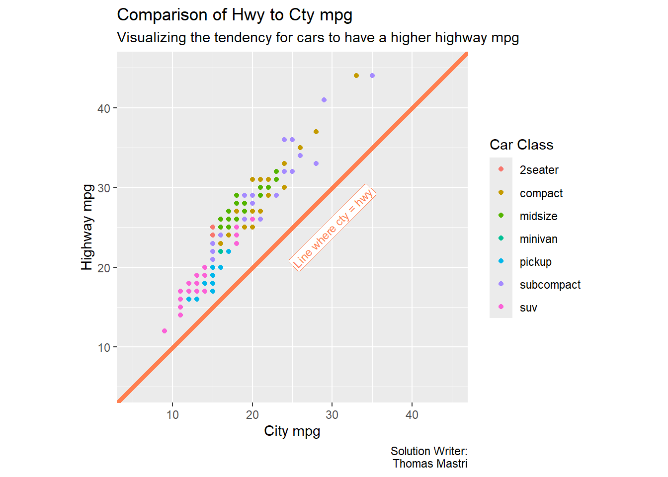
If you set color and shape to the same variable, ggplot will automatically make a single legend. If you choose 2 different variables, then it will make 2 legends to accommodate all the combinations. Also, you should note some values overlap in the plot, an improvement you can do is to jitter the values to make sure more values are appropriately visualized.
- Jitter function explained in this r4ds section from chapter 9.
mpg |>
  ggplot(aes(cty, hwy, color = drv, shape = drv)) +
  geom_point() +
  labs(
    x = 'City MPG',
    y = 'Highway MPG',
    color = 'Type of drive train',
    shape = 'Type of drive train'
  )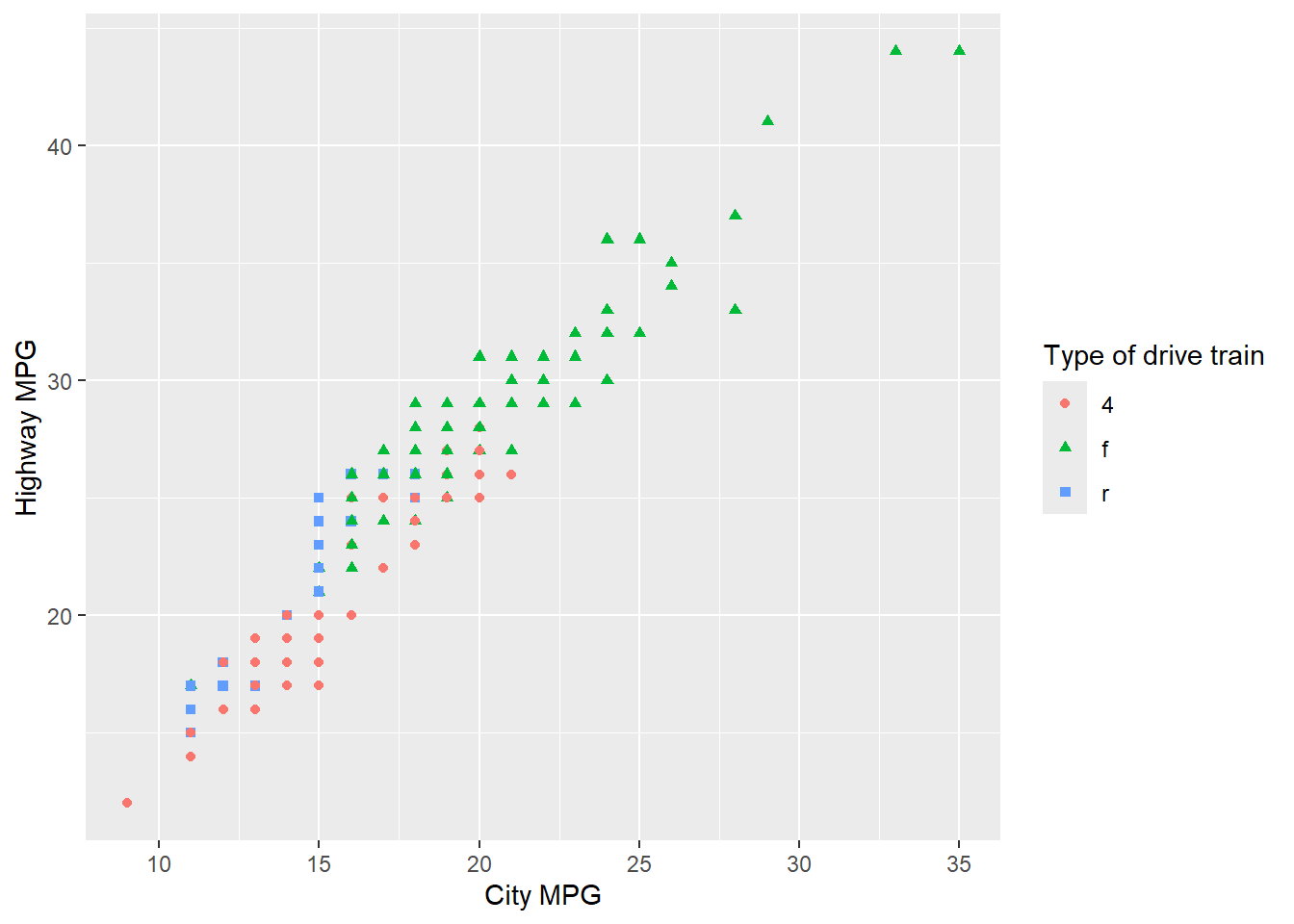
Made a simple plot showing off the Lahman package in case you’re a baseball stats nerd, but make your own plot.
library(Lahman)

Batting |>
  filter(G >= 100 & yearID >= 1900) |>
  ggplot(aes(yearID, HR)) +
  geom_point(alpha = 1/10) +
  geom_smooth(formula = y ~ x, method = 'lm', se = FALSE, color = 'red')+
  labs(
    title = 'HRs by MLB Players Each Season',
    subtitle = 'For players with 100+ games played that year',
    x = 'Year',
    y = 'Dingers'
  )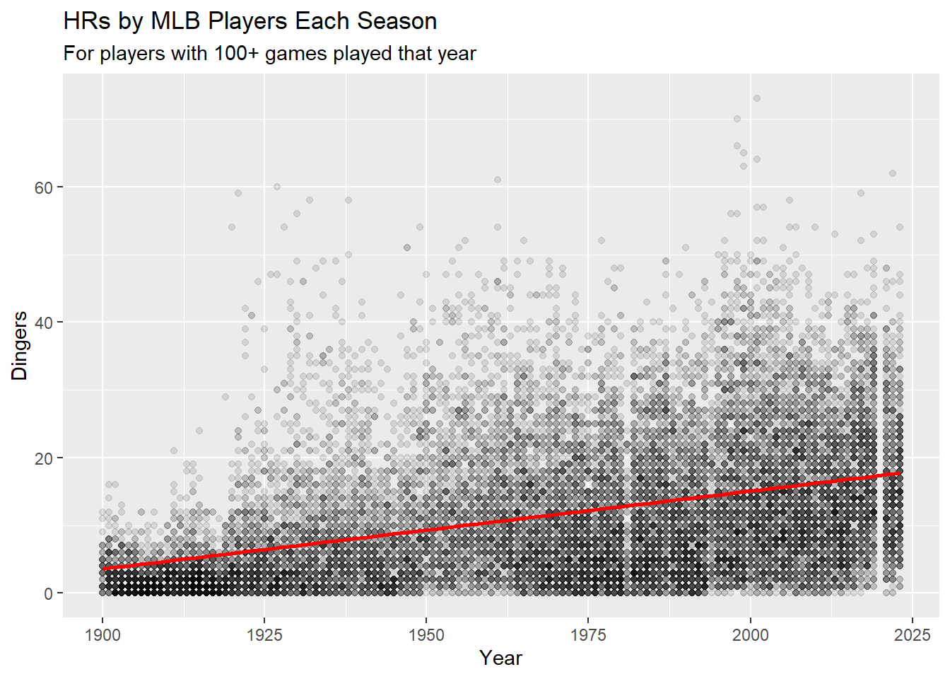
11.3.1 Exercises:
Can read more about the nuances of hjust/vjust and other aesthetics by using the command:
vignette("ggplot2-specs")vignettes are longer-form articles and in-depth explanations of packages.
can see all vignettes in a package using the command:
vignette(package = package_name)
plot_1 <- mpg |>
  ggplot(aes(cty, hwy))+
  geom_point()+
  geom_text(label = 'top-right', x = Inf, y = Inf, hjust = 1, vjust = 1) +
  geom_text(label = 'top-left', x = -Inf, y = Inf, hjust = 0, vjust = 1) +
  geom_text(label = 'bottom-right', x = Inf, y = -Inf, hjust = 1, vjust = 0) +
  geom_text(label = 'bottom-left', x = -Inf, y = -Inf, hjust = 0, vjust = 0)
plot_1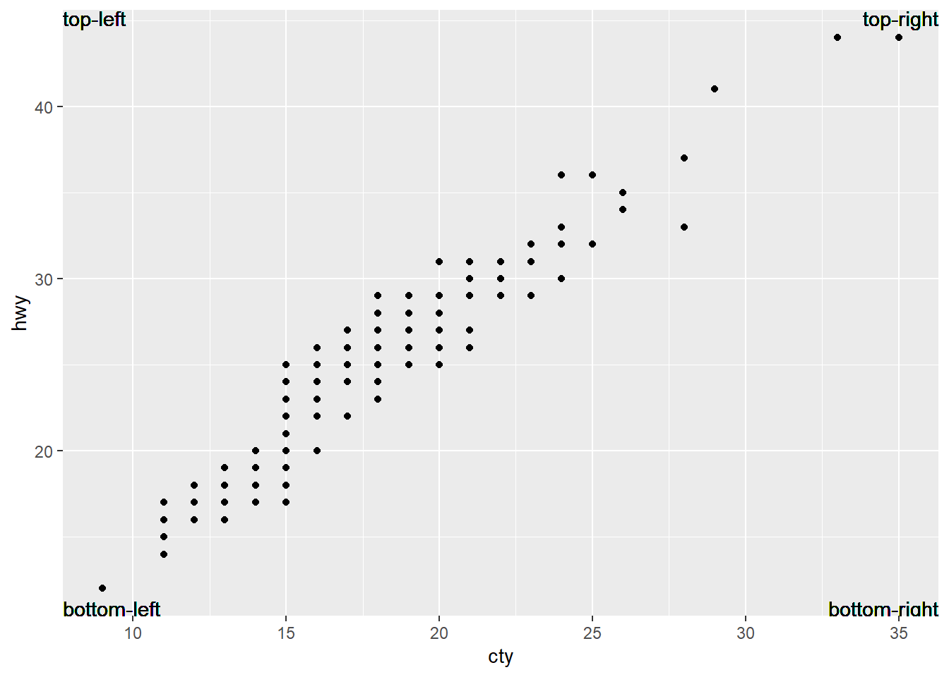
I Created 2 plots:
The first I just ball-parked by eye what I thought the center was.
the second I pull the ranges of the axes to find the true center point. To simplify this, you can manually set the limits to the original graph using
coord_cartesian, but I thought this would be a fun exercise to extract some of the underlying structure of a ggplot.
plot_1 +
  annotate(
    geom = "point",
    x = 21, y = 29,
    fill = 'gold',
    size = 8,
    shape = 22
  )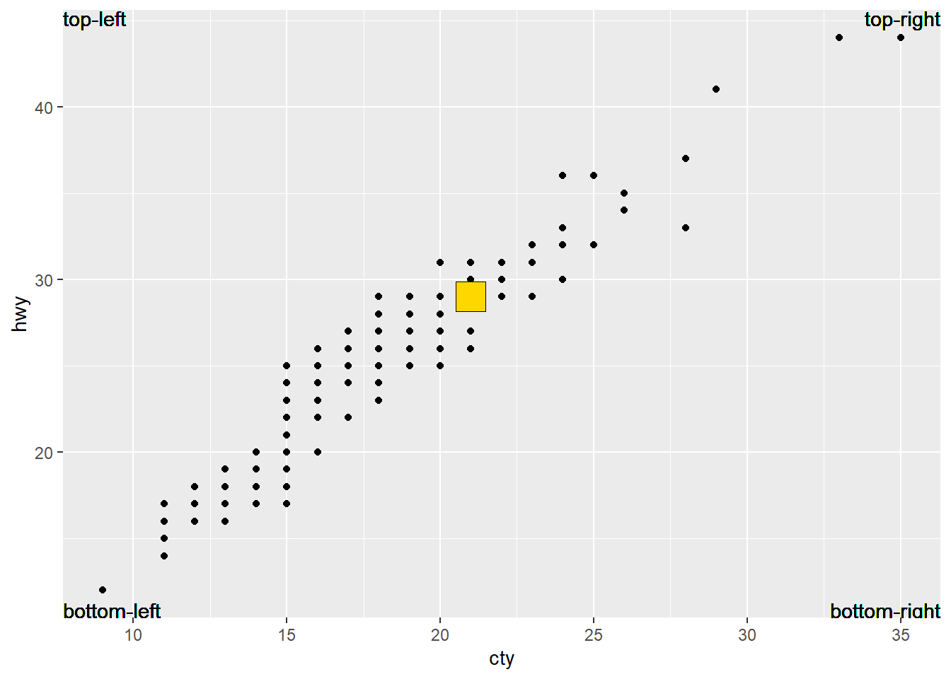
true_centered_x <-  (layer_scales(plot_1)$x$range$range[2] +
  layer_scales(plot_1)$x$range$range[1]) / 2
true_centered_y <-  (layer_scales(plot_1)$y$range$range[2] +
  layer_scales(plot_1)$y$range$range[1]) / 2

plot_1 +
  annotate(
    geom = "point",
    x = true_centered_x,
    y = true_centered_y,
    fill = 'gold',
    size = 8,
    shape = 22
  )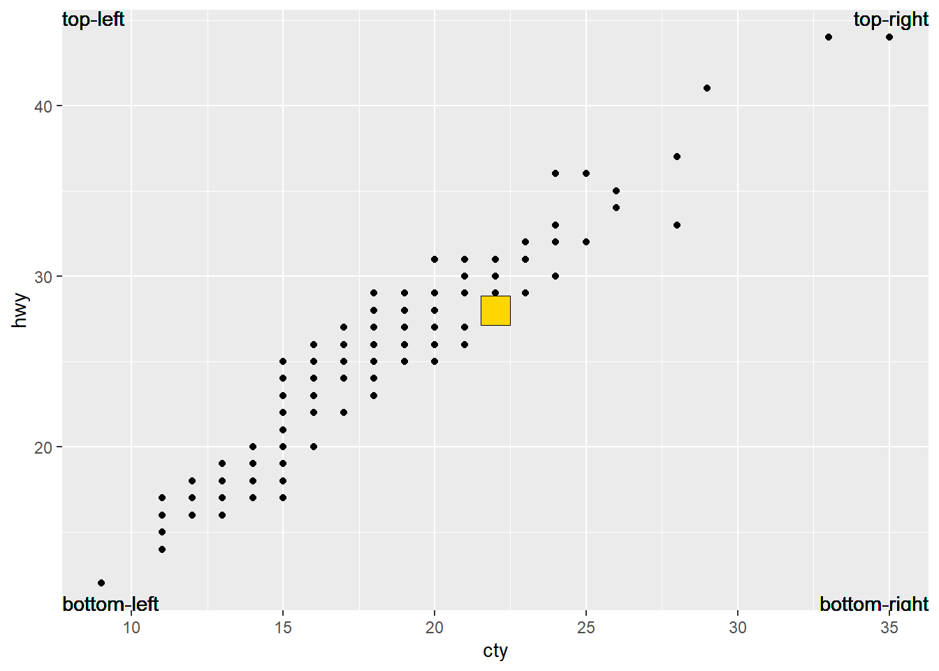
By default, if you facet after a geom_text call it will apply to all plots.
mpg_slice <- mpg |>
  slice(0:40)

mpg_slice |>
  ggplot(aes(cty, hwy)) +
  geom_point() +
  geom_text(aes(label = model),
            check_overlap = TRUE,
            hjust = 0, vjust = 1) +
  facet_wrap(~drv)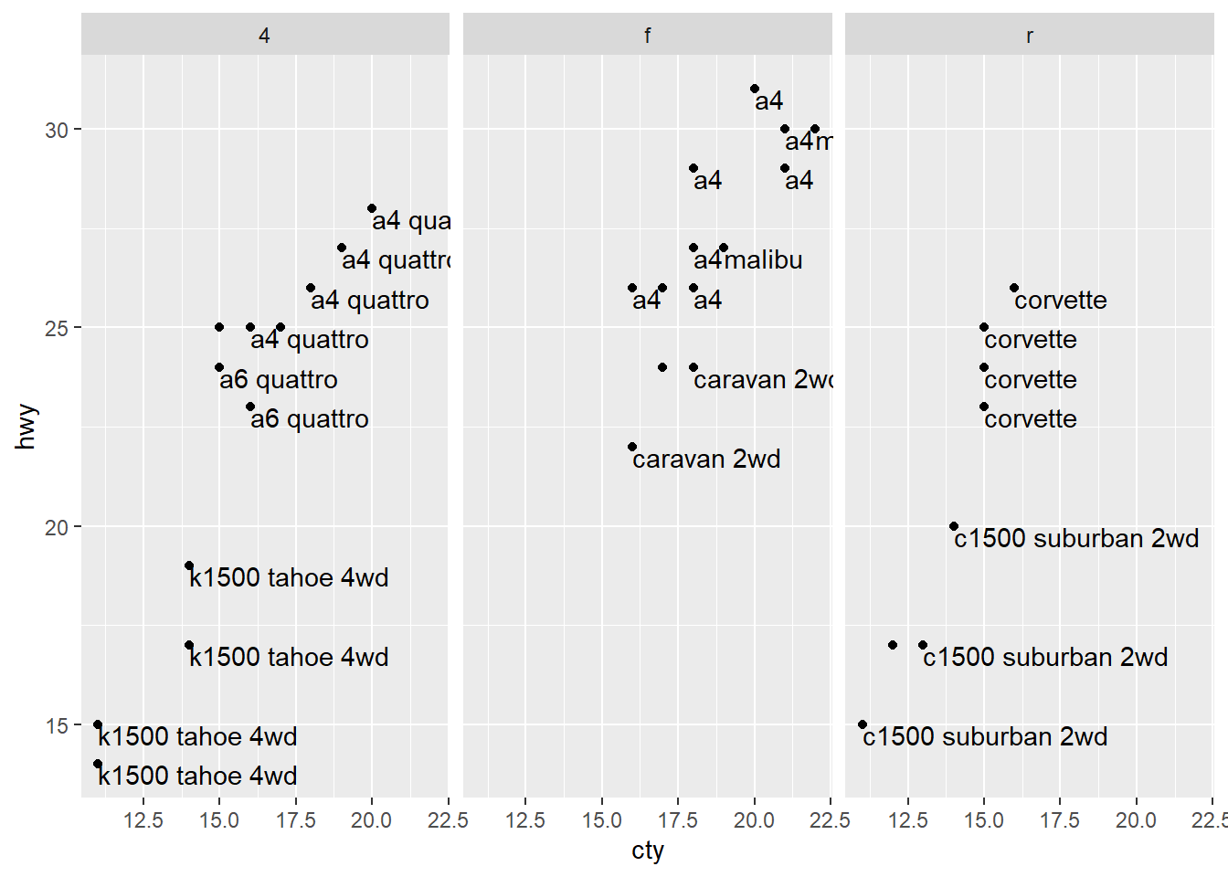
If you want to apply the geom_text to only one plot, you can filter the dataset being passed to geom_text.
mpg_slice |>
  ggplot(aes(cty, hwy)) +
  geom_point() +
  geom_text(data = mpg_slice[mpg_slice$drv == 'f',],
            aes(label = model),
            check_overlap = TRUE,
            hjust = 0, vjust = 1) +
  facet_wrap(~drv)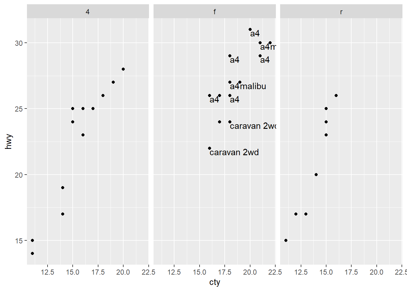
Can read the documentation for the geom_label() function for this information and more.
label.padding: Changes the amount of white space around a label.
label.r: Changes the roundness of label.
label.size: Changes the size of the outline of the label.
The 4 arguments to arrow are:
angle: Determines the width/sharpness of the arrow in degrees.
length: determines the length of arrow head
ends: determines which ends of the line gets the arrow head (“last”, “first” or “both”)
type: Either “open” or “closed” triangle head.
Here is a plot showing how the arguments alter the arrow.
mpg |>
  ggplot(aes(cty, hwy)) +
  geom_point() +
  annotate(
    geom = 'segment',
    x = 15, xend = 25,
    y = 15, yend = 25,
    arrow = arrow(type = 'closed',
                  ends = 'both'
                  )
  ) +
  annotate(
    geom = 'segment',
    x = 15, xend = 25,
    y = 30, yend = 40,
    arrow = arrow(
      angle = 15,
      type = 'open',
      length = unit(.5, 'inches')
    )
  )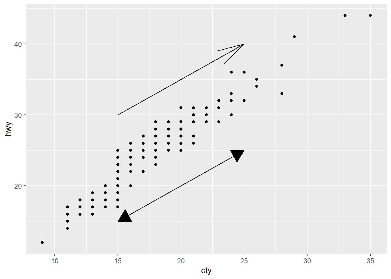
11.4.6 Exercises:
You need to use
scale_fill_gradientin order to color in the plot. This is a bit counter-intuitive, since if you want to change the color of the plot when using thegeom_hexfunction arguments, you want to use color, since the fill argument removes any gradient from the hexagons.df <- tibble( x = rnorm(10000), y = rnorm(10000) ) ggplot(df, aes(x, y)) + geom_hex() + scale_fill_gradient(low = "white", high = "red") + coord_fixed() ## Warning: Computation failed in `stat_binhex()`. ## Caused by error in `compute_group()`: ## ! The package "hexbin" is required for `stat_bin_hex()`.
ggplot(df, aes(x, y)) +
  geom_hex(color = 'blue') +
  coord_fixed()
## Warning: Computation failed in `stat_binhex()`.
## Caused by error in `compute_group()`:
## ! The package "hexbin" is required for `stat_bin_hex()`.
ggplot(df, aes(x, y)) +
  geom_hex(fill = 'blue') +
  coord_fixed()
## Warning: Computation failed in `stat_binhex()`.
## Caused by error in `compute_group()`:
## ! The package "hexbin" is required for `stat_bin_hex()`.
he first argument for a scale is the name, which gets used as the axis or legend title. (To read the documentation for a function, use the command
?name_of_function).mpg |> ggplot(aes(cty, hwy)) + geom_point() + scale_x_continuous('blah') + labs(x = 'blagg')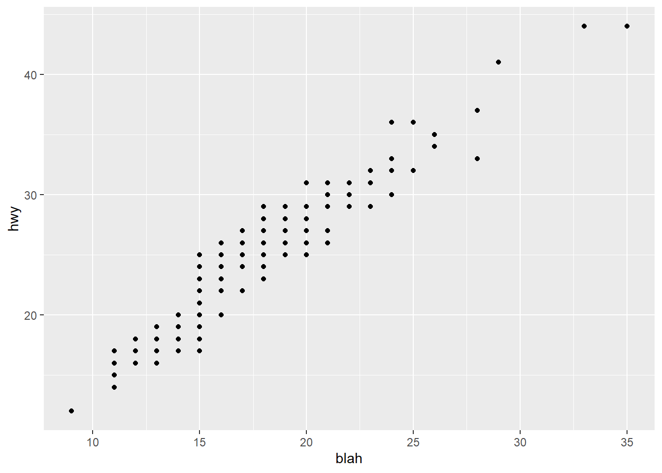
- While the output looks the same as labs, adding the name as an argument in the scale function overrides the value given to labs.
plot below:
presidential |>
  mutate(id = 33 + row_number()) |>
  ggplot(aes(x = start, y = id, color = party, label = name)) +
  geom_point() +
  geom_segment(aes(xend = end, yend = id), linewidth = 1) +
  scale_x_date(date_breaks = "4 years", date_labels = "%Y",
               guide = guide_axis(angle = 45))+
  scale_color_manual(values = c(Republican = "red", Democratic = "blue"))+
  scale_y_continuous(breaks = seq(34,45, by=1))+
  geom_text(size=3, vjust = 1, hjust=0)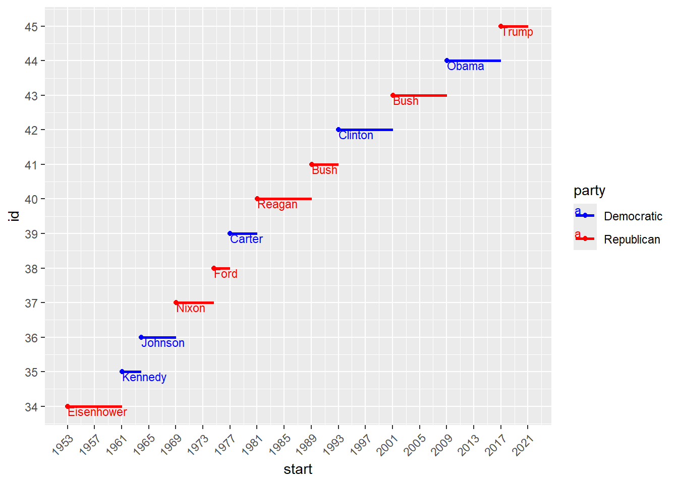
plot below:
diamonds |>
ggplot(aes(x = carat, y = price)) +
  geom_point(aes(color = cut), alpha = 1/20)+
  guides(color = guide_legend(override.aes = list(size = 3, alpha = 1) ) )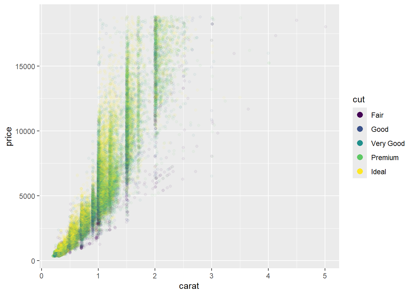
11.5.1 Exercises:
Make your own plot. I decided to make 2 simple plots to show how a white graph background looks on a white webpage. (As influenced by footnote #2 in this chapter which explains why they chose a gray background for the default graph).
mpg_barplot <- mpg |>
  ggplot(aes(drv)) +
  geom_bar()

mpg_barplot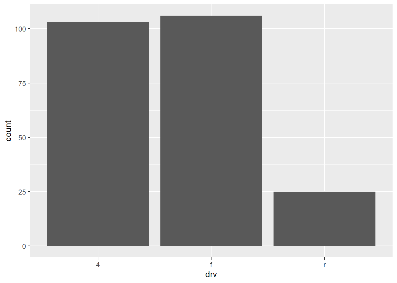
mpg_barplot +
  theme_classic()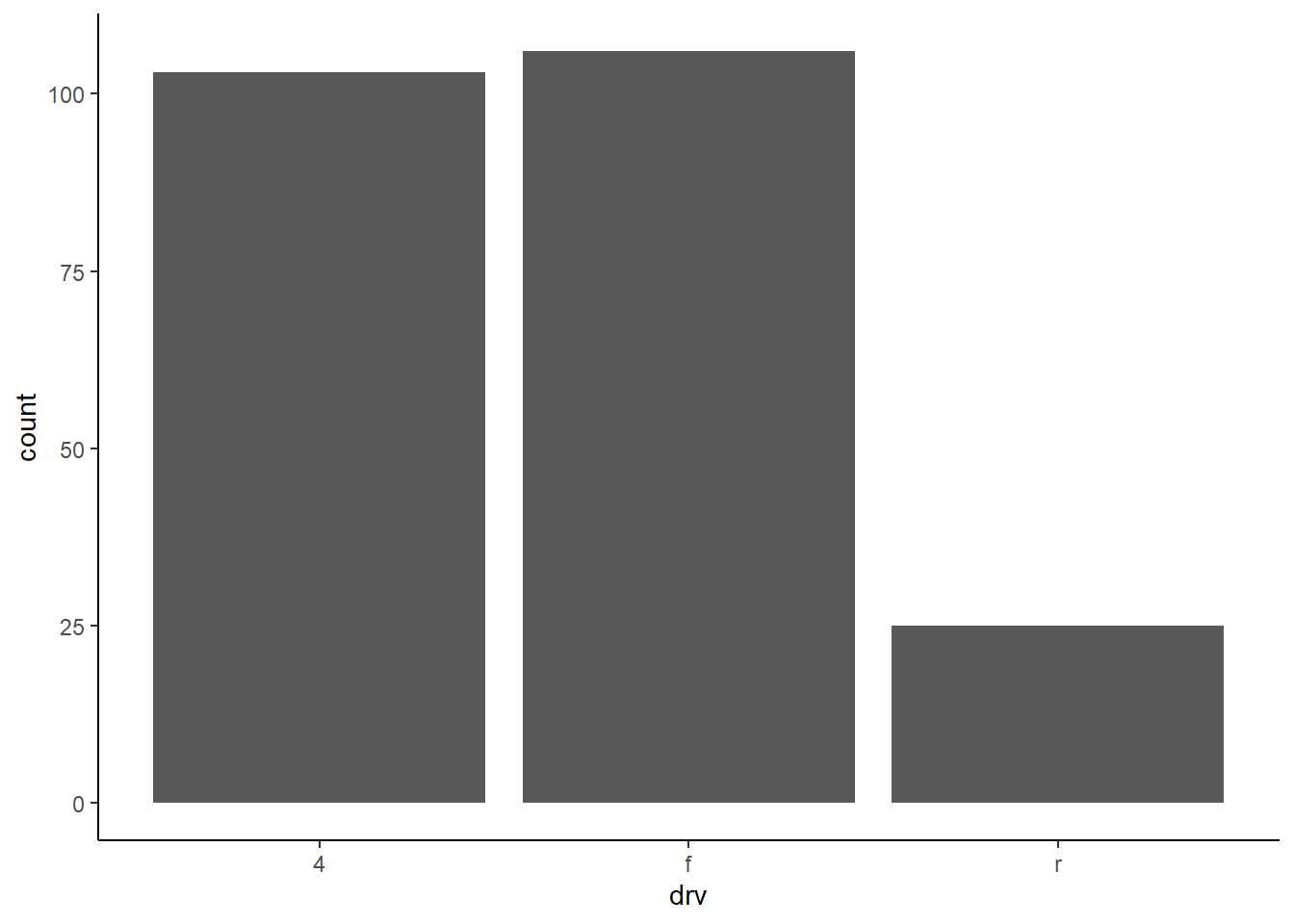
Admittedly a bit hard to see, but it’s blue:
mpg_barplot +
  theme(
      axis.text.x = element_text(color = 'blue', face = 'bold', size =6)
    )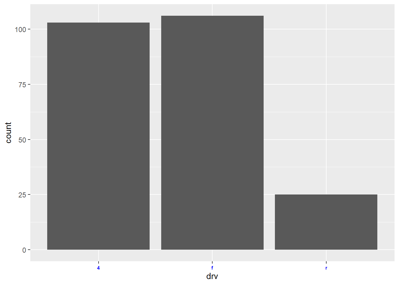
11.6.1 Exercises:
It’s an order of operations issue, since
/gets evaluated before+or|.Can read the documentation here.
If getting an error, make sure you have the patchwork package installed.
Use parentheses to override the default order of operations.
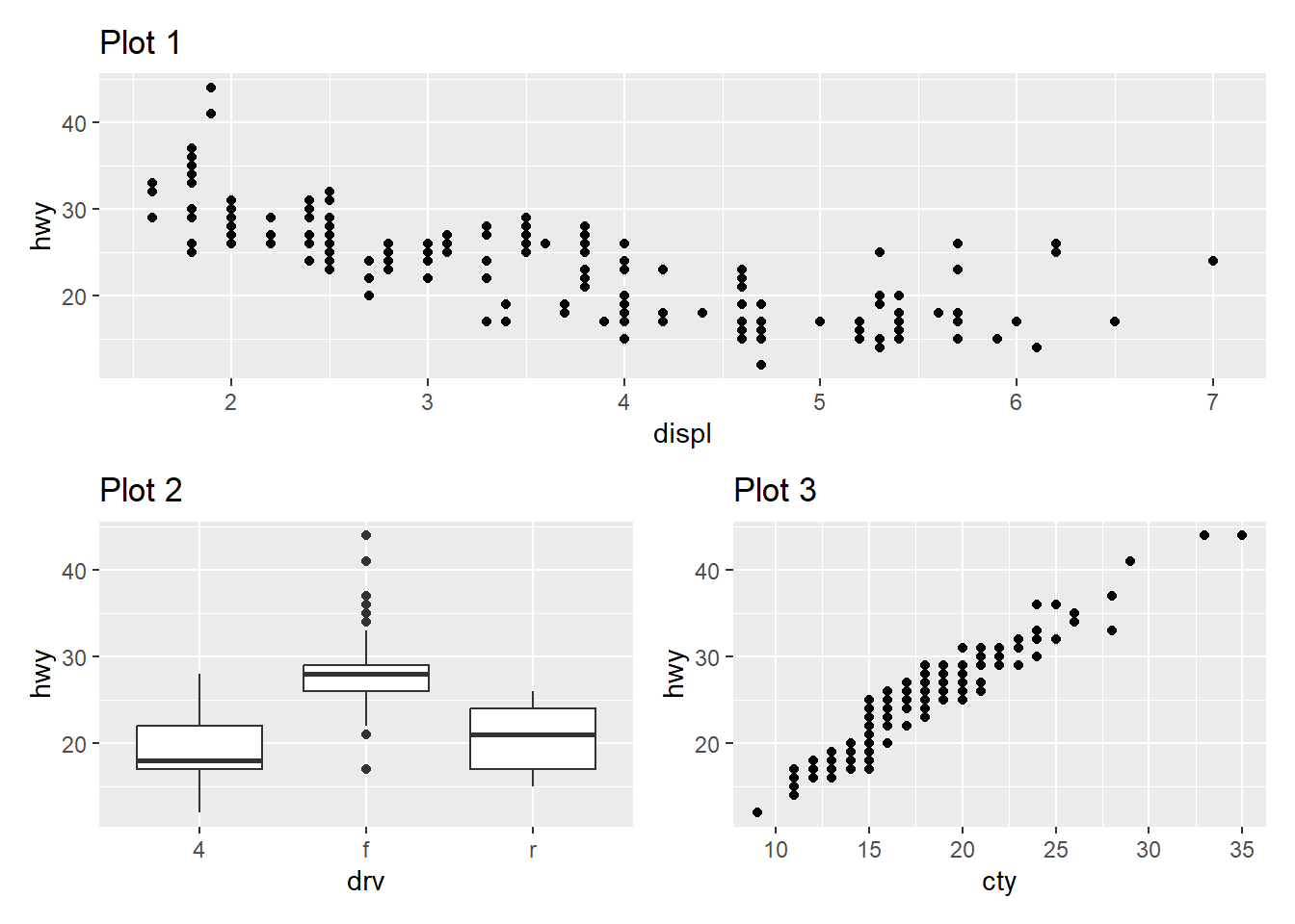
p1 <- ggplot(mpg, aes(x = displ, y = hwy)) +
  geom_point() +
  labs(title = "Plot 1")
p2 <- ggplot(mpg, aes(x = drv, y = hwy)) +
  geom_boxplot() +
  labs(title = "Plot 2")
p3 <- ggplot(mpg, aes(x = cty, y = hwy)) +
  geom_point() +
  labs(title = "Plot 3")

p1 / (p2 + p3)