library(tidyverse)
library(nycflights13)ch_19_solutions
Prerequisites:
19.2.4 Exercises:
We can use origin from weather to join with faa from airports.
We would then be able to connect it to destination. It is not currently a key since many values would not have a match.
It is the hour when clocks were rolled back to standard time after daylight savings.
weather |>
  count(year, month, day, hour, origin) |>
  arrange(desc(n))
## # A tibble: 26,112 × 6
##     year month   day  hour origin     n
##    <int> <int> <int> <int> <chr>  <int>
##  1  2013    11     3     1 EWR        2
##  2  2013    11     3     1 JFK        2
##  3  2013    11     3     1 LGA        2
##  4  2013     1     1     1 EWR        1
##  5  2013     1     1     1 JFK        1
##  6  2013     1     1     1 LGA        1
##  7  2013     1     1     2 EWR        1
##  8  2013     1     1     2 JFK        1
##  9  2013     1     1     2 LGA        1
## 10  2013     1     1     3 EWR        1
## # ℹ 26,102 more rows
19.3.4 Exercises:
I used base R’s
summaryfunction to quickly give me a reference point for what constitutes a high/low value during the 2 worst days.worst_2_days <- flights |> left_join(weather |> select(origin, time_hour, temp, wind_speed, visib, precip)) |> group_by(year, month, day) |> summarise( dep_delay = mean(dep_delay, na.rm = TRUE), n = n(), avg_wind = mean(wind_speed, na.rm = TRUE), avg_vis = mean(visib, na.rm = TRUE), avg_precip = mean(precip, na.rm = TRUE), .groups = 'drop' ) ## Joining with `by = join_by(origin, time_hour)` worst_2_days |> top_n(2, dep_delay) ## # A tibble: 2 × 8 ## year month day dep_delay n avg_wind avg_vis avg_precip ## <int> <int> <int> <dbl> <int> <dbl> <dbl> <dbl> ## 1 2013 3 8 83.5 979 16.7 5.41 0.0227 ## 2 2013 7 1 56.2 966 10.4 8.30 0.0452 worst_2_days |> summary() ## year month day dep_delay ## Min. :2013 Min. : 1.000 Min. : 1.00 Min. :-1.330 ## 1st Qu.:2013 1st Qu.: 4.000 1st Qu.: 8.00 1st Qu.: 4.577 ## Median :2013 Median : 7.000 Median :16.00 Median : 7.982 ## Mean :2013 Mean : 6.526 Mean :15.72 Mean :12.715 ## 3rd Qu.:2013 3rd Qu.:10.000 3rd Qu.:23.00 3rd Qu.:16.698 ## Max. :2013 Max. :12.000 Max. :31.00 Max. :83.537 ## ## n avg_wind avg_vis avg_precip ## Min. : 634.0 Min. : 3.942 Min. : 1.599 Min. :0.0000000 ## 1st Qu.: 902.0 1st Qu.: 8.421 1st Qu.: 9.391 1st Qu.:0.0000000 ## Median : 964.0 Median :10.729 Median : 9.997 Median :0.0000000 ## Mean : 922.7 Mean :11.139 Mean : 9.256 Mean :0.0044161 ## 3rd Qu.: 985.0 3rd Qu.:13.293 3rd Qu.:10.000 3rd Qu.:0.0004358 ## Max. :1014.0 Max. :28.941 Max. :10.000 Max. :0.1640513 ## NA's :1 NA's :1 NA's :1- The days with the highest delays had high levels of precipitation and wind while lower levels of visibility.
Joining a data set onto a transformation of itself is very handy whenever you want to add group statistics to the original data set.
flights2 <- flights |>
  mutate(id = row_number(), .before = 1)

top_dest <- flights2 |>
  count(dest, sort = TRUE) |>
  head(10)

top_dest |>
  inner_join(flights, join_by(dest == dest))
## # A tibble: 141,145 × 20
##    dest      n  year month   day dep_time sched_dep_time dep_delay arr_time
##    <chr> <int> <int> <int> <int>    <int>          <int>     <dbl>    <int>
##  1 ORD   17283  2013     1     1      554            558        -4      740
##  2 ORD   17283  2013     1     1      558            600        -2      753
##  3 ORD   17283  2013     1     1      608            600         8      807
##  4 ORD   17283  2013     1     1      629            630        -1      824
##  5 ORD   17283  2013     1     1      656            700        -4      854
##  6 ORD   17283  2013     1     1      709            700         9      852
##  7 ORD   17283  2013     1     1      715            713         2      911
##  8 ORD   17283  2013     1     1      739            745        -6      918
##  9 ORD   17283  2013     1     1      749            710        39      939
## 10 ORD   17283  2013     1     1      828            830        -2     1027
## # ℹ 141,135 more rows
## # ℹ 11 more variables: sched_arr_time <int>, arr_delay <dbl>, carrier <chr>,
## #   flight <int>, tailnum <chr>, origin <chr>, air_time <dbl>, distance <dbl>,
## #   hour <dbl>, minute <dbl>, time_hour <dttm>
Surprisingly not, my speculation is that it’s probably maintenance or downtime of the sensors but I couldn’t find any pattern for which hours are missing.
flights |>
  anti_join(weather, join_by(origin, time_hour)) |>
  count(time_hour)
## # A tibble: 48 × 2
##    time_hour               n
##    <dttm>              <int>
##  1 2013-01-01 12:00:00    39
##  2 2013-01-06 06:00:00    13
##  3 2013-02-20 14:00:00    20
##  4 2013-02-22 21:00:00     9
##  5 2013-04-02 20:00:00    16
##  6 2013-07-02 07:00:00    25
##  7 2013-07-02 09:00:00    17
##  8 2013-08-19 17:00:00    74
##  9 2013-08-22 18:00:00    44
## 10 2013-08-22 20:00:00    48
## # ℹ 38 more rows
Notice that for my grid of plots I specify columns that are character, this is because geom_bar won’t work with numeric data. From this you can see that 3 carriers, 9E, UA and US have the majority of missing tail numbers.
flights |>
  anti_join(planes, join_by(tailnum)) |>
  filter(!is.na(tailnum)) |>
  select(-tailnum) |>
  pivot_longer(where(is.character)) |>
  ggplot(aes(value)) +
  geom_bar() +
  facet_wrap(~name, scales = 'free_x')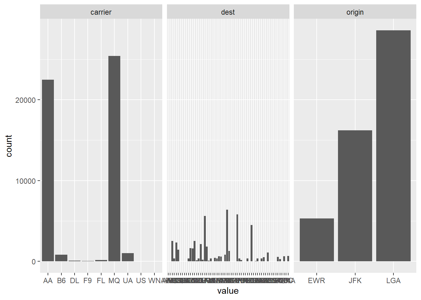
flights |>
  anti_join(planes, join_by(tailnum)) |>
  filter(!is.na(tailnum)) |>
  count(carrier)
## # A tibble: 9 × 2
##   carrier     n
##   <chr>   <int>
## 1 AA      22474
## 2 B6        830
## 3 DL        110
## 4 F9         47
## 5 FL        187
## 6 MQ      25395
## 7 UA       1007
## 8 US         36
## 9 WN          8
There are some planes that have flown for multiple carriers, making you reject the hypothesis that every tailnum has a single carrier. this is admittedly a rare occurence, since only 2 combinations of carrier ever share a plane (9E/EV, FL/DL) .
planes |>
  inner_join(flights[c('tailnum', 'carrier')], join_by(tailnum)) |>
  group_by(tailnum) |>
  summarise(
    carriers = paste(unique(carrier), collapse = ', '),
    number_carriers = n_distinct(carrier),
    flights = n()
  ) |>
  arrange(desc(number_carriers))
## # A tibble: 3,322 × 4
##    tailnum carriers number_carriers flights
##    <chr>   <chr>              <int>   <int>
##  1 N146PQ  9E, EV                 2      44
##  2 N153PQ  9E, EV                 2      31
##  3 N176PQ  9E, EV                 2      28
##  4 N181PQ  9E, EV                 2      39
##  5 N197PQ  9E, EV                 2      33
##  6 N200PQ  9E, EV                 2      35
##  7 N228PQ  9E, EV                 2      28
##  8 N232PQ  9E, EV                 2      42
##  9 N933AT  FL, DL                 2      35
## 10 N935AT  FL, DL                 2      88
## # ℹ 3,312 more rows
I personally found it easier to rename the columns using the
suffixargument in the join function. Otherwise I prefer to rename columns before joining since I think it’s easy to mix up columns when they have a generic name.airport_loc <- airports |> select(faa, lon, lat) flights |> select(origin, dest) |> left_join(airport_loc, join_by(origin == faa)) |> left_join(airport_loc, join_by(dest == faa), suffix = c('_origin', '_dest')) ## # A tibble: 336,776 × 6 ## origin dest lon_origin lat_origin lon_dest lat_dest ## <chr> <chr> <dbl> <dbl> <dbl> <dbl> ## 1 EWR IAH -74.2 40.7 -95.3 30.0 ## 2 LGA IAH -73.9 40.8 -95.3 30.0 ## 3 JFK MIA -73.8 40.6 -80.3 25.8 ## 4 JFK BQN -73.8 40.6 NA NA ## 5 LGA ATL -73.9 40.8 -84.4 33.6 ## 6 EWR ORD -74.2 40.7 -87.9 42.0 ## 7 EWR FLL -74.2 40.7 -80.2 26.1 ## 8 LGA IAD -73.9 40.8 -77.5 38.9 ## 9 JFK MCO -73.8 40.6 -81.3 28.4 ## 10 LGA ORD -73.9 40.8 -87.9 42.0 ## # ℹ 336,766 more rowsUsed the viridis color scales which give me a few colorful options out of the box.
flights |>
  group_by(dest) |>
  summarise(avg_delay = mean(dep_delay, na.rm = TRUE)) |>
  ungroup() |>
  inner_join(airports, join_by(dest == faa)) |>
  ggplot(aes(x = lon, y = lat, color = avg_delay)) +
    scale_colour_viridis_c() +
    borders("state") +
    geom_point() +
    coord_quickmap()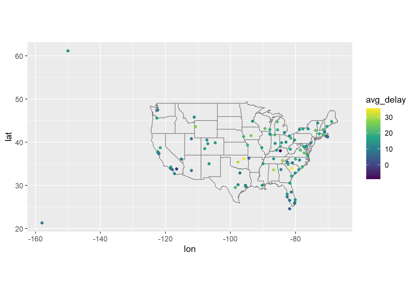
Can get storm reports for that date here. The high delays in East Tennessee’s airport are explained the high amount of storms on that date in and around Virginia.
flights |>
  filter(year == 2013, month == 6, day == 13) |>
  group_by(dest) |>
  summarise(avg_delay = mean(dep_delay, na.rm = TRUE)) |>
  ungroup() |>
  inner_join(airports, join_by(dest == faa)) |>
  ggplot(aes(x = lon, y = lat, color = avg_delay)) +
    scale_colour_viridis_c(option = 'turbo') +
    borders("state") +
    geom_point() +
    coord_quickmap()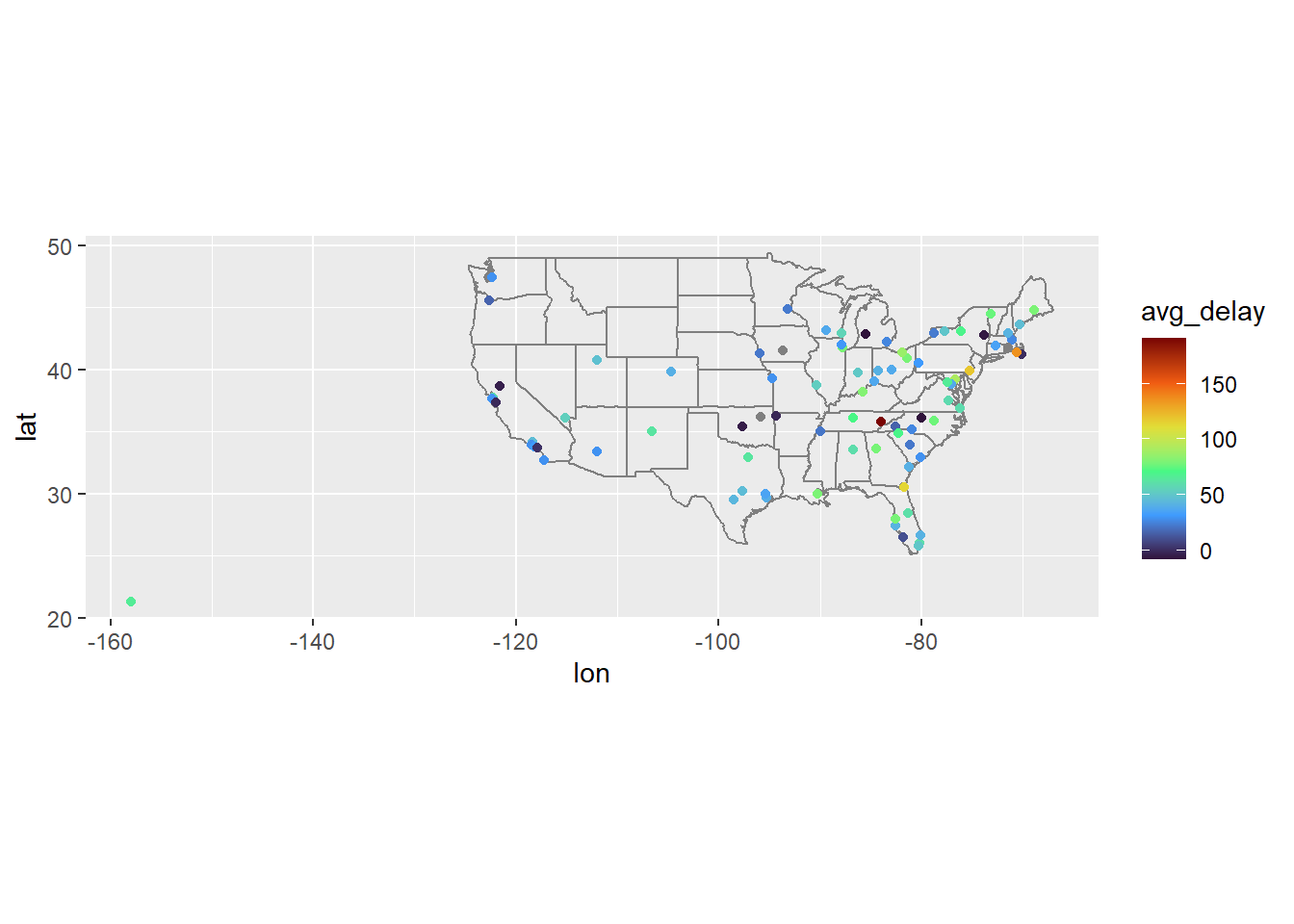
19.5.5 Exercises:
By default it retains key columns from x only. If
keep=TRUEthen we include all keys, and therefore a column for both X and Y keys.It includes all rows since a value will overlap with itself. The simplest way to avoid this is to rewrite so an id can’t equal itself.
#Showing what happens w/o q < q
parties <- tibble(
  q = 1:4,
  party = ymd(c("2022-01-10", "2022-04-04", "2022-07-11", "2022-10-03")),
  start = ymd(c("2022-01-01", "2022-04-04", "2022-07-11", "2022-10-03")),
  end = ymd(c("2022-04-03", "2022-07-11", "2022-10-02", "2022-12-31"))
)

parties |>
  inner_join(parties, join_by(overlaps(start, end, start, end))) |>
  select(start.x, end.x, start.y, end.y)
## # A tibble: 6 × 4
##   start.x    end.x      start.y    end.y
##   <date>     <date>     <date>     <date>
## 1 2022-01-01 2022-04-03 2022-01-01 2022-04-03
## 2 2022-04-04 2022-07-11 2022-04-04 2022-07-11
## 3 2022-04-04 2022-07-11 2022-07-11 2022-10-02
## 4 2022-07-11 2022-10-02 2022-04-04 2022-07-11
## 5 2022-07-11 2022-10-02 2022-07-11 2022-10-02
## 6 2022-10-03 2022-12-31 2022-10-03 2022-12-31