library(tidyverse)
library(nycflights13)Ch.13 Solutions
Prerequisites
13.3.1 Exercises:
Code below:
flights |>
  count(is.na(dep_time))
## # A tibble: 2 × 2
##   `is.na(dep_time)`      n
##   <lgl>              <int>
## 1 FALSE             328521
## 2 TRUE                8255
Documentation for
countoutlines how how it is analogous to usinggroup_byandsummarize(n = n()).#1. flights |> group_by(dest) |> summarise(n = n()) |> arrange(desc(n)) ## # A tibble: 105 × 2 ## dest n ## <chr> <int> ## 1 ORD 17283 ## 2 ATL 17215 ## 3 LAX 16174 ## 4 BOS 15508 ## 5 MCO 14082 ## 6 CLT 14064 ## 7 SFO 13331 ## 8 FLL 12055 ## 9 MIA 11728 ## 10 DCA 9705 ## # ℹ 95 more rows #2. flights |> group_by(tailnum) |> summarise(wt = sum(distance)) ## # A tibble: 4,044 × 2 ## tailnum wt ## <chr> <dbl> ## 1 D942DN 3418 ## 2 N0EGMQ 250866 ## 3 N10156 115966 ## 4 N102UW 25722 ## 5 N103US 24619 ## 6 N104UW 25157 ## 7 N10575 150194 ## 8 N105UW 23618 ## 9 N107US 21677 ## 10 N108UW 32070 ## # ℹ 4,034 more rows
13.4.8 Exercises:
Each line of the below code block represent one of the 7 lines used to create the plot.
#1. Pipes the dataset of interest to group_by

#2. Using integer division to get the hour from dep_time. This is necessary because sched_dep_time is coded like HHMM.

#3. Summarize function returns both the proportion of missing values and the count of flights that hour.

#4. Do this because there is only one value before hour 5 and it's at hour 1. Makes the plot much cleaner to remove it.

#5. Setting aesthetic globally since it will apply to both layers.

#6. Makes a line plot using the axes defined above. Also using a grey line is surprisingly much cleaner looking. (Run without that argument to see the difference, its much more than I expected.)

#7. Adds scatterpoints at the hour marks that are the size of the count at that hour.
Can run
?Trigto get the documentation on the different trig functions. By default they are in radians.Issue is rooted in the fact that dep_time is coded as a numeric variable in flights while time in acutality is base-60 (e.g. 459 to 500 is a gap of one minute in flights, not 41). I decided to do minutes since midnight:
flights |>
  mutate(
    dep_min_since_midnight = (dep_time %/% 100) * 60 + dep_time%%100,
    sched_dep_min_since_midnight = (sched_dep_time %/% 100) * 60 + sched_dep_time%%100
  ) |>
  select(
    dep_time,
    dep_min_since_midnight,
    sched_dep_time,
    sched_dep_min_since_midnight
  )
## # A tibble: 336,776 × 4
##    dep_time dep_min_since_midnight sched_dep_time sched_dep_min_since_midnight
##       <int>                  <dbl>          <int>                        <dbl>
##  1      517                    317            515                          315
##  2      533                    333            529                          329
##  3      542                    342            540                          340
##  4      544                    344            545                          345
##  5      554                    354            600                          360
##  6      554                    354            558                          358
##  7      555                    355            600                          360
##  8      557                    357            600                          360
##  9      557                    357            600                          360
## 10      558                    358            600                          360
## # ℹ 336,766 more rows
A bit trickier, since if it rounds to a 60 minute increment you need to move to the next hour (e.g. you want 500 not 460).
flights |>
  mutate(
    rounded_dep_time = if_else(
    (round((dep_time / 5)) * 5) %% 100==60,
    ceiling(dep_time / 100) * 100,
    round((dep_time / 5)) * 5
  )) |>
  select(dep_time, rounded_dep_time)
## # A tibble: 336,776 × 2
##    dep_time rounded_dep_time
##       <int>            <dbl>
##  1      517              515
##  2      533              535
##  3      542              540
##  4      544              545
##  5      554              555
##  6      554              555
##  7      555              555
##  8      557              555
##  9      557              555
## 10      558              600
## # ℹ 336,766 more rows
13.5.4 Exercises:
Different rank functions handle ties differently. For this questions I chose
min_ranksince it gives me a maximum of 10 rows (dense_rankmay give more than 10 rows) and I personally find it more intuitive thanrow_numberbecause I prefer ties to have the same ranking.flights |> mutate(rank = min_rank(desc(dep_delay))) |> filter(rank <= 10) ## # A tibble: 10 × 20 ## year month day dep_time sched_dep_time dep_delay arr_time sched_arr_time ## <int> <int> <int> <int> <int> <dbl> <int> <int> ## 1 2013 1 9 641 900 1301 1242 1530 ## 2 2013 1 10 1121 1635 1126 1239 1810 ## 3 2013 12 5 756 1700 896 1058 2020 ## 4 2013 3 17 2321 810 911 135 1020 ## 5 2013 4 10 1100 1900 960 1342 2211 ## 6 2013 6 15 1432 1935 1137 1607 2120 ## 7 2013 6 27 959 1900 899 1236 2226 ## 8 2013 7 22 845 1600 1005 1044 1815 ## 9 2013 7 22 2257 759 898 121 1026 ## 10 2013 9 20 1139 1845 1014 1457 2210 ## # ℹ 12 more variables: arr_delay <dbl>, carrier <chr>, flight <int>, ## # tailnum <chr>, origin <chr>, dest <chr>, air_time <dbl>, distance <dbl>, ## # hour <dbl>, minute <dbl>, time_hour <dttm>, rank <int>As an extension to my code below, could look into using other summary statistics (e.g. median) or ways to confirm the validity of my results (e.g. include the count of flights per tail or the distribution of delays to see if outliers could be misrepresenting the results).
flights |>
  group_by(tailnum) |>
  summarise(
    avg_delay = mean(dep_delay, na.rm = TRUE)
  ) |>
  mutate(most_delayed = min_rank(desc(avg_delay))) |>
  filter(most_delayed == 1)
## # A tibble: 1 × 3
##   tailnum avg_delay most_delayed
##   <chr>       <dbl>        <int>
## 1 N844MH        297            1
The fact that hour 5 and 23 have considerably less flights than other hours might make you question the significance of their result. As an extension, could include the standard deviation of delay to improve your results.
flights |>
  group_by(hour = sched_dep_time %/% 100) |>
  summarise(avg_delay = mean(is.na(dep_delay)), n=n()) |>
  mutate(min_rank = min_rank(desc(avg_delay))) |>
  arrange(avg_delay)
## # A tibble: 20 × 4
##     hour avg_delay     n min_rank
##    <dbl>     <dbl> <int>    <int>
##  1     5   0.00461  1953       20
##  2    23   0.0123   1061       19
##  3     7   0.0127  22821       18
##  4     9   0.0161  20312       17
##  5     8   0.0162  27242       16
##  6     6   0.0164  25951       15
##  7    10   0.0174  16708       14
##  8    11   0.0185  16033       13
##  9    12   0.0213  18181       12
## 10    13   0.0215  19956       11
## 11    14   0.0261  21706       10
## 12    17   0.0270  24426        9
## 13    15   0.0280  23888        8
## 14    18   0.0287  21783        7
## 15    22   0.0296   2639        6
## 16    16   0.0365  23002        5
## 17    21   0.0374  10933        4
## 18    20   0.0380  16739        3
## 19    19   0.0402  21441        2
## 20     1   1           1        1
Since you don’t supply a vector row_number, the first expression will return the first 3 rows per destination as they appear in the data set. In the second expression you rank by dep_delay, so it will give the 3 flights per destination with the lowest delay.
flights |> group_by(dest) |> filter(row_number() < 4)
## # A tibble: 311 × 19
## # Groups:   dest [105]
##     year month   day dep_time sched_dep_time dep_delay arr_time sched_arr_time
##    <int> <int> <int>    <int>          <int>     <dbl>    <int>          <int>
##  1  2013     1     1      517            515         2      830            819
##  2  2013     1     1      533            529         4      850            830
##  3  2013     1     1      542            540         2      923            850
##  4  2013     1     1      544            545        -1     1004           1022
##  5  2013     1     1      554            600        -6      812            837
##  6  2013     1     1      554            558        -4      740            728
##  7  2013     1     1      555            600        -5      913            854
##  8  2013     1     1      557            600        -3      709            723
##  9  2013     1     1      557            600        -3      838            846
## 10  2013     1     1      558            600        -2      753            745
## # ℹ 301 more rows
## # ℹ 11 more variables: arr_delay <dbl>, carrier <chr>, flight <int>,
## #   tailnum <chr>, origin <chr>, dest <chr>, air_time <dbl>, distance <dbl>,
## #   hour <dbl>, minute <dbl>, time_hour <dttm>
flights |>
  group_by(dest, flight) |>
  summarise(flight_delay = sum(dep_delay)) |>
  mutate(dest_delay = sum(flight_delay, na.rm = TRUE))
## `summarise()` has grouped output by 'dest'. You can override using the
## `.groups` argument.
## # A tibble: 11,467 × 4
## # Groups:   dest [105]
##    dest  flight flight_delay dest_delay
##    <chr>  <int>        <dbl>      <dbl>
##  1 ABQ       65         1239       3490
##  2 ABQ     1505         2251       3490
##  3 ACK     1191          614       1711
##  4 ACK     1195           33       1711
##  5 ACK     1291          250       1711
##  6 ACK     1491          814       1711
##  7 ALB     3256            6       2529
##  8 ALB     3260          119       2529
##  9 ALB     3264            1       2529
## 10 ALB     3811           NA       2529
## # ℹ 11,457 more rows
This works because group_by peels a “layer” off when I use a second mutate/summarise function. So my mutate call is working as if the data is group by dest only, not dest and flight.
An older blog about this phenomena here.
# only the last 5 lines are added by me
library(ggpmisc)
## Loading required package: ggpp
## Registered S3 methods overwritten by 'ggpp':
##   method                  from
##   heightDetails.titleGrob ggplot2
##   widthDetails.titleGrob  ggplot2
##
## Attaching package: 'ggpp'
## The following object is masked from 'package:ggplot2':
##
##     annotate

flights |>
  mutate(hour = dep_time %/% 100) |>
  group_by(year, month, day, hour) |>
  summarize(
    dep_delay = mean(dep_delay, na.rm = TRUE),
    n = n(),
    .groups = "drop"
  ) |>
  filter(n > 5) |>
  mutate(previous_delay_lag = lag(dep_delay)) |>
  ggplot(aes(dep_delay, previous_delay_lag))+
  geom_point() +
  stat_poly_line() +
  stat_poly_eq()
## Warning: Removed 426 rows containing non-finite outside the scale range
## (`stat_poly_line()`).
## Warning: Removed 426 rows containing non-finite outside the scale range
## (`stat_poly_eq()`).
## Warning: Removed 426 rows containing missing values or values outside the scale range
## (`geom_point()`).
Used the ggpmisc package to quickly add a regression line with the R^2.
geom_smooth()can also make a regression line, but ggpmisc makes adding the R^2 especially easy.
flights |>
  group_by(dest) |>
  mutate(mean_air = mean(air_time, na.rm = TRUE),
         prop_air = air_time / mean_air * 100) |>
  select(dest, mean_air, prop_air) |>
  arrange(prop_air)
## # A tibble: 336,776 × 3
## # Groups:   dest [105]
##    dest  mean_air prop_air
##    <chr>    <dbl>    <dbl>
##  1 BOS       39.0     53.9
##  2 ATL      113.      57.6
##  3 GSP       93.4     58.9
##  4 BOS       39.0     59.0
##  5 BNA      114.      61.2
##  6 MSP      151.      61.8
##  7 PHL       33.2     63.3
##  8 PHL       33.2     63.3
##  9 PHL       33.2     63.3
## 10 CVG       96.0     64.6
## # ℹ 336,766 more rows
The above table tells me that the fastest flight has an airtime that is 54% of the mean flight for that destination. While definitely quick, I don’t consider this a data entry error given how many other flights also take up ~60% of the mean time.
To find the flights that were most delayed in the air, I am going to compare dep_delay to arr_delay.
flights |>
  mutate(air_delay = arr_delay - dep_delay) |>
  arrange(desc(air_delay)) |>
  select(flight, tailnum, air_delay, dep_delay, arr_delay)
## # A tibble: 336,776 × 5
##    flight tailnum air_delay dep_delay arr_delay
##     <int> <chr>       <dbl>     <dbl>     <dbl>
##  1    399 N629VA        196        -2       194
##  2    707 N3EXAA        181        -2       179
##  3    996 N593UA        165       180       345
##  4   1465 N711ZX        161        16       177
##  5   3199 N5PBMQ        157        43       200
##  6   1619 N970DL        154        -9       145
##  7   2395 N931DL        153        11       164
##  8   4580 N12122        150       291       441
##  9   2793 N657MQ        150        41       191
## 10   2083 N565AA        148        -5       143
## # ℹ 336,766 more rows
Again, nothing screams data entry error since I have personally been on flights spent taxiing due to gate issues.
flights |>
  group_by(dest, carrier) |>
  summarise(avg_delay = mean(dep_delay, na.rm = TRUE), .groups = 'drop') |>
  mutate(
    dest_rank = row_number(avg_delay),
         count_carrier = n_distinct(carrier)
  ) |>
  filter(count_carrier >= 2) |>
  select(dest, carrier, avg_delay, dest_rank) |>
  arrange(dest, dest_rank)
## # A tibble: 314 × 4
##    dest  carrier avg_delay dest_rank
##    <chr> <chr>       <dbl>     <int>
##  1 ABQ   B6         13.7         174
##  2 ACK   B6          6.46         66
##  3 ALB   EV         23.6         289
##  4 ANC   UA         12.9         161
##  5 ATL   9E          0.965        32
##  6 ATL   WN          2.34         39
##  7 ATL   MQ          9.35        107
##  8 ATL   DL         10.4         119
##  9 ATL   UA         15.8         202
## 10 ATL   FL         18.4         240
## # ℹ 304 more rows
Like exercise #5, I am using the “peel” of group_by so the summarize call is grouping by both dest and carrier while the mutate call is grouping by dest only.
13.6.7 Exercises:
Lots of potential answers so just giving some aspects to consider:
- Can take arr_delay minus dep_delay to get the amount of air delay.
- mean vs. median depends on context. If you have a lot of outliers you should probably prefer median.
- can use
?planesto read about the table. Would be useful if you want to see if plane age/speed has an effect on delay. - the package also has a weather table. Could use to see if delay correlates with visibility or precipitation at a nearby weather station.
flights |>
  mutate(air_speed = distance / air_time) |>
  group_by(dest) |>
  summarize(sd_speed = sd(air_speed, na.rm = TRUE)) |>
  arrange(desc(sd_speed))
## # A tibble: 105 × 2
##    dest  sd_speed
##    <chr>    <dbl>
##  1 OKC      0.639
##  2 TUL      0.624
##  3 ILM      0.615
##  4 BNA      0.615
##  5 CLT      0.611
##  6 MSY      0.603
##  7 HOU      0.603
##  8 MEM      0.599
##  9 AUS      0.596
## 10 XNA      0.596
## # ℹ 95 more rows
Curiously, both #1 and #2 in my data are in Oklahoma.
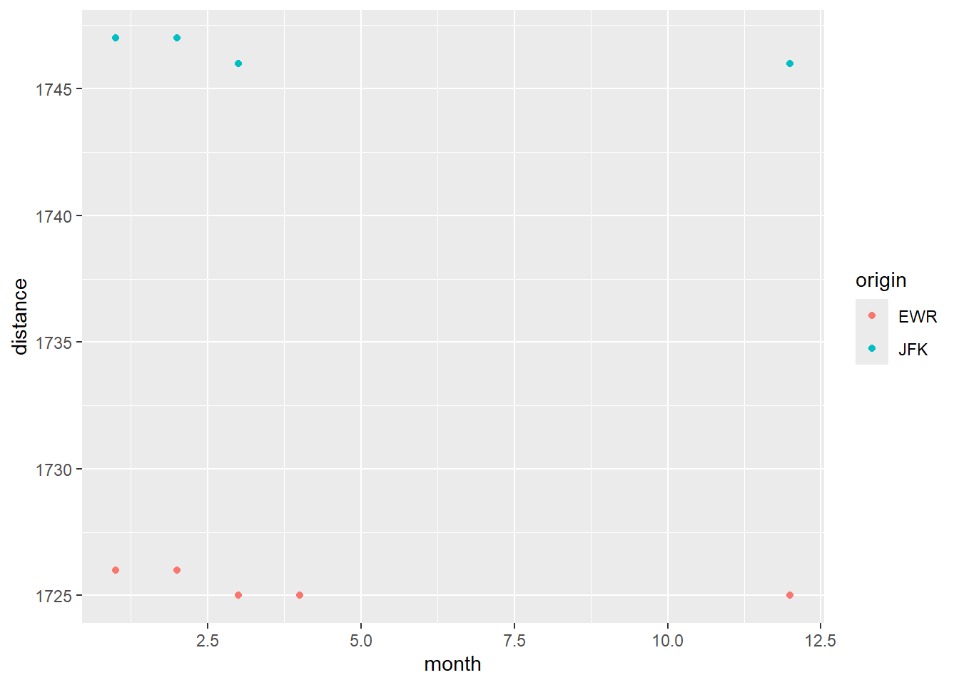
To see if airports move locations, I graphed the distance of the flights to EGE by month. Flights from both EWR and JFK seemed to have decreased a mile which makes me think the airport may have re-positioned the runways. (FYI reading the wikipedia page for Veil Airport, I am honestly not sure what caused the change in 2013).
flights |>
  filter(dest == 'EGE') |>
  group_by(month, origin) |>
  summarise(distance = mean(distance), .groups = 'drop') |>
  ggplot(aes(month, distance, color = origin)) +
  geom_point()